Color Combo Special #2: Monochromatic Schemes

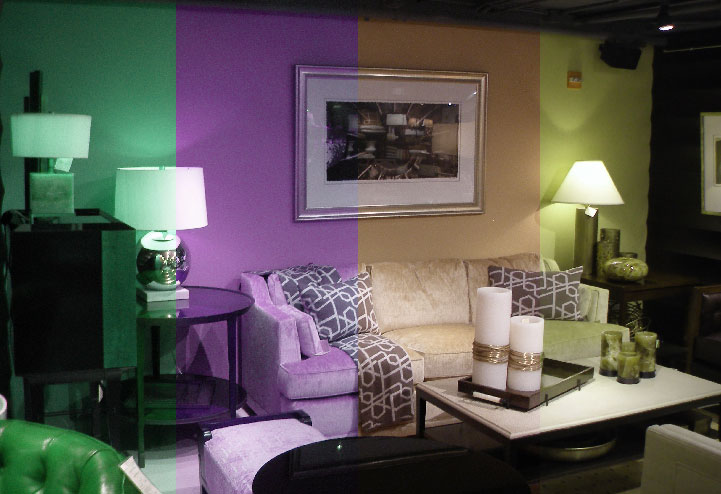
This is an example of a very natural monochromatic color scheme. It's warm and inviting, isn't it?

Monochromatic schemes are probably the easiest way to “get it right” when it comes to color combinations.  Practical for staging houses and other times when a tried-and-true method to create a simple, pleasing decor is what you want, monochromatic combinations follow a simple formula that gives you nearly guaranteed success.

That formula? Just pick one color.  It could be your favorite color, the color that creates the mood you’re trying to inspire, or the color that will appeal to the widest possible audience.  For staging purposes, it is usually good to go with a light-toned, space-creating neutral like white, cream, or beige.  For personal decoration purposes, think of a color that you will really enjoy over a long span of time, and in many different moods.

Once you’ve picked your color, you get to do the fun part.  Without varying the core color, or hue, in color classification lingo, create several different shades of that color by varying the value (lightness or darkness), and the chroma (brightness or dullness).  You can start with a buttery cream, for example, and mix in black to create a darker umber color for one of the accent colors, and then turn up the intensity to create a bold, warm mustard yellow for another.  As long as you stay within the same hue (or an extremely tight range), you can play with the value and the chroma almost indefinitely, and you will still end up with a pleasing color combination.  The variation created by the shading will give your composition texture, but your colors are very unlikely to ever clash.

And there is actually a surprising range of effects you can create using a monochromatic scheme.  For example, a blue-based scheme that starts with a main color of bright cornflower blue, and accents it with a strong navy and a shocking bright-sky color, is going to make a much bolder statement than a dull blue-gray that is accented with a paler blue-gray and some slate-colored trim, even though in both cases you have essentially an all-blue room.

Remember to take into account the other objects in your composition that will provide colors that you might not have predicted: your rugs, furniture, and other decorations in your interior, or your bricks, deck, patio, roof, and landscaping in your exterior.  If it becomes too difficult to keep everything exactly the same color, you might want to look into analogous color schemes as a method of providing more variety, which will be discussed in the next installment.  Stay tuned!


Top Five Reasons Why Paint Fails

Hasty application of a second coat of paint before the first coat is fully dry is a major cause of alligatoring.

Nothing is more frustrating than a failed paint job – especially if it fails right after it is applied.  Luckily, the most common reasons for premature paint failure are well-known, and can be prevented.  Here, Blue Door Painters lists the top five reasons for paint failure, and what can be done to prevent them.

1. Inadequate preparation. A surface needs to be thoroughly stripped of loose material, scraped, sanded, caulked, cleaned, and primed prior to application of a new coat of paint, or that paint does not have good odds of staying successfully adhered to the surface.  Blue Door Painters follows a strict regimen of surface preparation before all of our jobs in order to prevent this form of failure.

2. Bad weather. The weather cannot be too cold or too wet while paint is drying and curing, or the film will not form adequately.  For this reason, Blue Door Painters pays close attention to the weather when scheduling exterior jobs.  Ideally, conditions should be warm and dry for 24 hours following a new paint job.

3. Cheap paint.  While you don’t necessarily need to buy the premiere designer paints, the extremely cheap paints contain a surplus of useless filler components, and are not built to last.  Blue Door Painters recommends purchasing a good, solid, tried-and-true brand of paint like Duron or Sherwin-Williams.

4. Improper priming.  While some brands of paint claim that their products can be used without a primer, in our experience painting most surfaces without a primer is a recipe for coating failure.  A prime coat is specially designed to adhere to the substrate – and should be selected to adhere to the specific substrate you are dealing with.  It takes a different kind of paint to adhere well to metal, wood, drywall, old paint, masonry, etc. – and this is the specific purpose of your primer.  In Blue Door Painters opinion, this is not a step that shoudl be skipped.

5. Hasty Application.  Failing to wait for full drying and curing between coats, laziness in prepping the surface, and hasty application of paint leaving gaps in the continuous film are all leading causes of paint failure.  Painting a wall may seem simple, but it really does need to be done right.  Which is why Blue Door Painters staff are all held to the highest possible standards of craftsmanship, so that we produce a paint job that we can stand behind.

Wallpapering for Children: Fun With Murals

Muralists have created a new approach to old wallpaper patterns like this one. (photo by dleafy)

Wallpaper means patterns.  That’s what initially made wallpaper attractive as a wall covering; with wallpaper, you can get a factory-prepared pattern repeating perfectly across a large surface, without having to worry about the tedium of trying to stencil a repeating pattern by hand.

However, in modern days, the medium of wallpaper has been used to achieve a different effect; that of a painted mural.  Particularly for children’s rooms, wallpaper murals are an attractive, and easy, alternative to artwork.  Since they are applied directly to the wall, they give the room the look of actually being in whatever fun, exotic location the mural depicts – the zoo, the jungle, under the sea, in Disneyland.  Recent design styles have experimented with wallpaper murals of all different sizes, from smaller murals that can be used as accents, to larger murals intended to cover entire walls.

Wallpaper murals aren’t just for kids, either; in some modern homes, daring designers are experimenting with sophisticated designs and hip artwork in adult living rooms, bathrooms, and bedrooms.

Prep: The Bedrock of Any Paint Job

Prep your surfaces before new paint jobs.

A paint job is only as good as the preparation that goes into it.

If there were a stone onto which the ten commandments of painting were carved, that one would be right at the top, all in capital letters.

In order for a paint job to work correctly, it has to stick to the surface it is meant to coat.  That paint does stick to the surface is something that most people take for granted, but it is actually the result of years of clever engineering.  Paint is a liquid, which, when spread across a vertical surface (or even applied to a ceiling, directly in opposition to gravity), rather than running down and collecting on the floor, stays adhered in a thin film where it is applied, forming a solid coating.  Only a mixture with just the right viscosity and chemical composition can manage this feat that we take so much for granted.

And that is when the surface to which it is being applied is a continuous solid.  What happens when you put a new coat of paint on top of a surface covered in loose material – dirt, grease, chipping or peeling remnants of an old paint or wallpapering job?  Well, the new paint attempts to do what it was engineered to do – form a strong, continuous film.  The problem is, when you form a continuous film over a discontinuous surface, tension gets added to the loose particles, and they tend to loosen further, pulling away from the rest of the surface.  The film of paint covering therefore starts to get torn in different directions and pull away from its close adhesion to the rest of the surface, causing all sorts of problems.  Take a wall with chipping paint, for example.  If you paint over it, as the new paint dries, it contracts and adheres to the whole surface, including the flakes of loose paint.  By contracting, it pulls some of those loose flakes off the wall.  This may form cracks in the film between the paint adhered to the loose chip and the paint adhered to the rest of the wall.  It also creates a void behind the film, in which moisture and mildew can collect, leading to the steady erosion of the film.

What is the solution to this problem?  Extremely careful preparation of the surface before a new paint job is administered.  Blue Door Painters follows a strict preparation regimen of stripping, sanding, scraping, caulking, replacing failing drywall and plaster, and thorough cleaning before administering any new coatings to a substrate.  That way, we ensure that we have put up a coating that was truly prepared to last.

Challenges of Spring Weather (Painting and the Rain)

Moisture can ruin paint. An exterior job can take about 24 hours to cure. (photo by bjwok)

Discussion of the Seasonal Challenges Facing Exterior Painting Projects from a Washington, DC area Contractor

Scheduling exterior projects is always a little bit of a challenge for a painting company, because we cannot control the weather.  We can buy the paint or stain, collect our equipment, and get our crew ready and onsite – but if the sky does not cooperate, we have to turn right back around and head home, scheduling the work for another day.

Why is that?  Because coatings (coatings is an industry term for paints, stains, glazes, and any other finish that covers the surface of a substrate) do not dry, cure, and form a film correctly if the weather is too cold or too moist.  The chemical components in most modern coatings contain water (there are still oil-based paints and stains out there, but they are slowly being replaced by water-based products due to the ease of cleanup, quick drying time, and environmental friendliness of water-based paints), and the way that the coatings dry and cure requires that water to evaporate, turning the substance from a liquid film to a solid coating.  If the air is too humid, the water will not evaporate in its proper sequence, and the coating will therefore form inadequately and the entire paint job will likely fail.  In the cold, not only is there insufficient heat to encourage the water to evaporate (it may, in fact, go in the opposite direction and freeze, which causes almost certain coating failure), the cool air can hold far less moisture and is therefore saturated much more easily, making it nearly impossible for water to evaporate.

For this reason, work on exterior projects stops during the cold season in temperate climates like the Washington, DC / Northern Virginia area.  Once the temperature warms up, everyone in the industry – customers and contractors alike – are excited to resume exterior work.  Early Spring is a good time to get your home beautified for summer, to up your curb appeal in time for the early June real estate sales rush, and to clean, stain, and seal your deck in order to protect it from the activity of the coming summer.  However, with spring warmth comes an additional challenge, which can make it difficult to schedule exterior work – spring rains.

Needless to say, you can’t put wet paint up on the wall during a torrential downpour and expect it to stay up there and form a strong coating.  But what many people don’t understand is that rainfall at any point during the critical drying/curing process can substantially effect the film formation, even if it seems like the coating is already dry.  It takes the average exterior latex paint 4-6 hours to dry fully – but the curing process can take up to 24 hours, depending on the humidity.  Extreme humidity preceding or following a rainstorm can greatly affect the paint’s dry time.  Ideally, exterior jobs should be scheduled when the humidity is average or lower, and when there is no rain in the forecast for the next 24 hours.

Of course, in the Spring, days like those can be hard to come by.  So the best bet for you, if you are planning an exterior project, is to schedule and contract your work early, so that it can be postponed until conditions are ideal (or as close to it as they’re going to get), and still meet your schedule, giving you a finished exterior in time for late spring and early summer enjoyment.

Spring Cleaning

Fresh paint = fresh look! (photo by Janaka Dharmasena)

Repainting Makes Your Walls Look Far Cleaner – Advice on Spring Cleaning from Washington, DC area painting contractor

It’s easy to look right past your old paint job without seeing it, you’re so used to the sight of the familiar grease stains, fingerprints, pen marks, and accumulated dust.  It isn’t until you see your walls with a fresh paint job that you can really measure how dirty your walls have become over the years.  Which is why a fresh paint job should be the centerpiece of your spring cleaning efforts.

On interiors, filth tends to collect on trim, in kitchens and bathrooms, and in high-traffic areas like hallways and stairwells.  Even if the bulk of the surface area on your walls is in pretty good shape, buying a single gallon of paint in a lively color and freshening up the trim around doors, windows, and molding can make a huge difference in how fresh your house looks, not to mention giving you a good excuse to go for a color change in preparation for spring.

For the exterior, once the weather clears enough to get work done, you want to assess the damage done to your siding, masonry, decking, patios, and fences during the harsh winter months.  Decks might have weathered from holding all of the winter’s snow, while siding and masonry might have sustained water damage.  It is also worth inspecting your gutters, the rims of your roof, and the interior of your home just under the eaves for evidence of water damage resulting from ice dams.  Once you have a solid inventory of the damage, getting your exterior repainted, and your deck or fencing stained and sealed, prior to the onset of the spring rains and prior to the full flowering of your spring landscaping, is a good way to beautify your exterior in anticipation of the spring.

Taking the time to repaint, even if it’s just a small area of your home, can really go a long way toward making your space look refreshed, and make you feel renewed and ready for spring.

How Much Color Do You Want in an Interior?

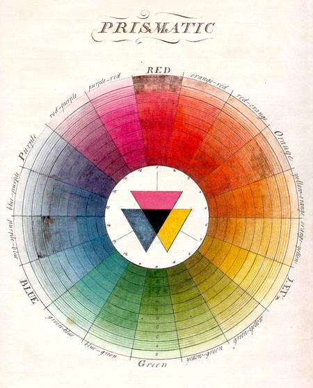
This amazing color wheel was created by Moses Harris (1731-1785)

Tips from expert color consultants on interior design in the Washington, DC area

There are six basic strategies for using the color wheel to develop harmonious color palettes. We’ve listed them below, in order from the most conservative to the most daring.  All you need is a basic subtractive color wheel (3 primary colors, 3 secondary colors, and 3 tertiary colors), and you are ready to get started trying out combinations.  When deciding which strategy to use, you will need to consider what kind of visual and emotional impact you want your space to have.


SIX COLOR PICKING STRATEGIES

– Monotonal: Take one small slice of the wheel, and pick three our four shades that are both close together, and similar in value (light vs dark) and chroma (bright vs dull), and you have a monotonal color scheme.  Monotonal color schemes are ideal for settings where you want the decor to fade into the background, perhaps as a setting for brightly colored art or furniture.  If you intend to use monotonal furnishings and decorations as well, you should be careful that the color concentration doesn’t become overwhelming.

– Monochromatic: Monochromatic color schemes involve a similarly small slice of the color wheel (i.e., all blue, or all yellow) – but cast the net wider to include a variety of values and chromes.  So a monochromatic blue scheme, for example, might include a pastel baby blue, a grayish slate-blue, a deep navy, and a bright cornflower blue for accents.  The strength of monochromatic schemes is that they usually do come out looking harmonious, and they can maintain a consistent mood, but they allow for enough contrast to give the decor some texture.

– Analogous: For an analogous color scheme, you get to carve out a slightly larger slice of the wheel, collecting several base hues clustered on the same side.  Blue and green, for example, or blue, green, and violet, could be combined to create an analogous color scheme.  Analogous color schemes provide for a greater variety, while still maintaining a constant color ‘temperature’ (meaning the psychological impression of temperature, not the actual physical temperature) and offering a good chance of coming out harmonious.

– Complementary: Moving into the more daring color combinations; complementary color schemes involve jumping across the wheel.  First you pick a favorite color, and then you jump across the wheel and also collect its opposite.  The contrast you get from complementary color schemes is vivid, but they tend to look good together because colors that are directly opposite each other on the wheel develop good aesthetic balance.

– Split-Complementary/Double-Complementary: A more sophisticated strategy involves splitting each hue in a complementary color scheme into two.  Each pair of hues should be equally offset from the original central hue, and the variation should be slight, so that the color wheel balance is still achieved.  You can balance one color against one pair, or create two pairs opposite each other on the wheel.  Complementary color schemes offer a high degree of intricacy, and can create a pleasant combination, but you need to take care at this level of complexity that your colors do not start to clash.

– Triad/Tetrad: Finally, you can usually create a harmonious scheme using the triad or tetrad color picking strategy.  For this technique, you pick three colors that are evenly distributed around the wheel (like red, yellow, and blue, for example) – or four colors that are evenly distributed.  Once you pick the colors, you can play with the value and chroma to create a complex arrangement that is pleasing to the eye.

How Are Colors Classified?

A few examples of changes in hue.

Artists and poets have fallen in love with color for as long as there has been human culture, and there are a million beautiful color names that have been invented to describe the rich palettes that fill our world.  However, in an attempt to standardize a language of color for optimal communication, and to bring color analysis into the realm of science, several color classification systems have been developed.  The Munsell Color System, created by Albert H. Munsell in the early 1900s, is an example of a good, comprehensive classification system for organizing colors and analyzing the relationships between them.

Albert Munsell observed that the colors we see actually have three different dimensions, which vary independently of each other.  Two of these dimensions come from the two types of photoreceptive cells in our eyes, and the third is a combination of the two working together.

The Three Characteristics of Any Color

1. Hue – the particular wavelength in the rainbow or color wheel (detected by the cones in the eye)

2. Value – the lightness or darkness of the color, measured by the amount of black and white mixed in (detected by the rods in the eye)

3. Chroma (Sometimes called “intensity” or “saturation”) – the degree of pure color versus neutral tones (black/white/gray) in the mixture (detected by the rods and the cones together)

When you discuss color for the purposes of architectural decorating, all three of these characteristics are important, and all of them have a distinct impact on the color scheme that they create.  The hue, for example, determines the warmth or coolness of the color, and also plays a role in its psychological impact (we will discuss the basic psychological impact of all of the basic rainbow colors in another installment).  The value determines how much light the color reflects, which plays a role in “color contouring“, or using color to affect the perceived dimensions of a space.  Lighter colors make an area look lighter and more spacious, while darker colors make an area look heavier and more enclosed.  Finally, the chroma of a color plays a strong role in how aggressively the color grabs your attention.  If you want your decor to fade into the background, you want to use colors of a lower chroma than if you want your decor to attract attention.

When deciding on a color scheme, consider the hue, value, and chroma of all of your colors carefully, and watch how you mix and match – there is an infinite variety of beautiful color schemes out there.

What Is Color?

Discussion of Color Relevant to Painting and Refinishing in the Washington, DC Area

What, exactly, is color?  It is such a pervasive aspect of our lives that the question almost sounds absurd.  Color is color, and there isn’t anything else to it.  However, a deeper understanding of the physics and biology that create our experience of color can shed light on some of the intricacies of picking color for an interior or exterior painting project.

Human perception of color results from sensitive tissues in our eyes registering visible light of differing wavelengths and intensities.  Red light has the longest wavelength, shrinking as we proceed down the rainbow all the way to violet light, which has the shortest wavelength of the visible range.  Having visual sensitivity to this specific range of the electromagnetic spectrum (ie, being able to see in color) has been evolutionarily critical for human beings, because color is such a helpful cue in navigating our environment.  Important objects in our environment – like plants, water, and other animals – are more easily identified by their characteristic colors.

The path from a beam of light to our mental perception of color, however, has multiple steps involved.  First, light comes into our eye, both directly from a light source (such as when you look straight at a neon light), and also reflected off of the objects around us.  When reflected off of the objects in our environment, that light gives us critical information about our surroundings.  To formulate our visual field, and help us navigate, our eyes collect two kinds of information; the color’s value and the color’s hue, and there is a specialized type of photoreceptive cell in our retina (the area on the back of the eyeball that receives light) for each.


First, the rods in our retina collect information about how much (or little) light is being reflected off of each surface, we see giving us a visual field full of bright spots and shadows.  The amount of reflected light coming off of an object is sometimes called its color “value”, and it can be depicted on a grayscale.  Perceiving color values in our environment is critical for depth perception; our brain analyzes the lights and darks to figure out what is in the foreground, what is in the background, and what direction the light is coming from.

Unless you are black-white color blind, there is also a second set of photoreceptive cells in your retina, called the cones, which are oblivious to the amount of light coming in, but instead react to the wavelength, “color”, or “hue”, of that light.  In perceiving wavelength, the cones offer your brain a whole new set of inputs with which to make sense of the visual field.  While seeing in black and white is sufficient to detect depth, motion, and all of the fundamental attributes necessary to go about your daily life without bumping into things, color gives you critical information about the state of the objects in the world.  A leaf’s color, for example, can tell you if it is alive or dead; a fruit’s if it is green or ripe, an insect’s if it is poisonous or harmless, the sky’s if it is going to stay fair or rain.  In nature, many creatures use color as a language to communicate across species lines: the flower encourages insects to pollinate using bright colors, while the bright red frog warns predators that it is poisonous.  Perception of hue also lends a finer degree of detail to our sense of space and light; being able to tell that a shadow has a bluish tinge gives us a subtly different understanding than simply sensing how dark it is; perhaps the sun is setting, and the extra orange in the light is giving the shadow its complimentary tinge.

Finally, the information collected from the rods and cones in the eye has to be sent up to the brain in order to turn into a perception.  It is here that the brain taps into all the personal associations that you have formed with that particular color, and forms a unique experience of that color for you.  So as you can see, color perception is a complicated process, and one that allows for a wide variety of color perception between individuals.

Why Should I Pressure Wash?

The benefits of power washing technology for exterior projects in the Washington, DC area

Again and again, painting and refinishing contractors in the Washington, DC area are asked the same question: Why did my paint/stain fail?

Most of the time, the answer is the same.  It failed because the surface was inadequately prepared.  And usually, inadequate preparation translates directly to inadequate cleaning.  Dirty surfaces clogged with loose particles do not provide the constant, sturdy surface that paint needs in order to form a film, or stain needs to evenly penetrate.

Many techniques have been developed for cleaning and preparing substrates, but for exterior surfaces there is nothing on the market superior to the pressure washer (also called a power washer), for cleaning speed and effectiveness.  Employing a thin jet of high-pressured water, which can be manipulated to be focused or diffuse, the power washer can be used to remove dirt, grime, mildew, grease, and other stains from exterior surfaces like decks, siding, driveways, patios, concrete foundations, and stonework, all with stunning results.  The weather in the Washington, DC area, with its long, humid summers and its intense winters, takes a distinct toll on exterior surfaces (as well as their paint and stain jobs), making pressure-washing doubly important.

Blue Door Painters includes power washing with all of our exterior repainting and staining/sealing projects, so that we can ensure the best possible long-term results for our work.  Pressure washing all on its own can greatly beautify an exterior surface, however, even without a subsequent new paint or stain job.  Pressure washing an old deck, for example, brings about drastic results: the jet of water slicing right through years of grime and mildew, instantly turning the wood from gray to gold.  Just be warned: the beautiful results won’t be permanent without a protective coat of paint or stain to protect the freshly cleaned surface.

So to recap: why should you power wash?  Because you want to give the exterior of your home or building the best possible protection against the elements, and you recognize that thorough cleaning is an integral step in that procedure.