Tips from expert color consultants on interior design in the Washington, DC area
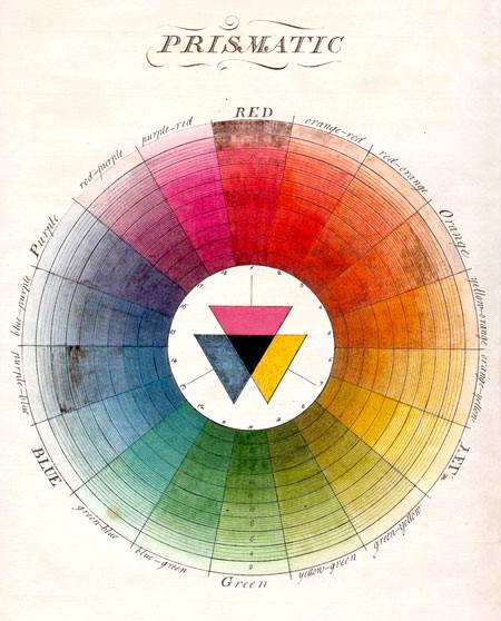
There are six basic strategies for using the color wheel to develop harmonious color palettes. We’ve listed them below, in order from the most conservative to the most daring. All you need is a basic subtractive color wheel (3 primary colors, 3 secondary colors, and 3 tertiary colors), and you are ready to get started trying out combinations. When deciding which strategy to use, you will need to consider what kind of visual and emotional impact you want your space to have.
SIX COLOR PICKING STRATEGIES
– Monotonal: Take one small slice of the wheel, and pick three our four shades that are both close together, and similar in value (light vs dark) and chroma (bright vs dull), and you have a monotonal color scheme. Monotonal color schemes are ideal for settings where you want the decor to fade into the background, perhaps as a setting for brightly colored art or furniture. If you intend to use monotonal furnishings and decorations as well, you should be careful that the color concentration doesn’t become overwhelming.
– Monochromatic: Monochromatic color schemes involve a similarly small slice of the color wheel (i.e., all blue, or all yellow) – but cast the net wider to include a variety of values and chromes. So a monochromatic blue scheme, for example, might include a pastel baby blue, a grayish slate-blue, a deep navy, and a bright cornflower blue for accents. The strength of monochromatic schemes is that they usually do come out looking harmonious, and they can maintain a consistent mood, but they allow for enough contrast to give the decor some texture.
– Analogous: For an analogous color scheme, you get to carve out a slightly larger slice of the wheel, collecting several base hues clustered on the same side. Blue and green, for example, or blue, green, and violet, could be combined to create an analogous color scheme. Analogous color schemes provide for a greater variety, while still maintaining a constant color ‘temperature’ (meaning the psychological impression of temperature, not the actual physical temperature) and offering a good chance of coming out harmonious.
– Complementary: Moving into the more daring color combinations; complementary color schemes involve jumping across the wheel. First you pick a favorite color, and then you jump across the wheel and also collect its opposite. The contrast you get from complementary color schemes is vivid, but they tend to look good together because colors that are directly opposite each other on the wheel develop good aesthetic balance.
– Split-Complementary/Double-Complementary: A more sophisticated strategy involves splitting each hue in a complementary color scheme into two. Each pair of hues should be equally offset from the original central hue, and the variation should be slight, so that the color wheel balance is still achieved. You can balance one color against one pair, or create two pairs opposite each other on the wheel. Complementary color schemes offer a high degree of intricacy, and can create a pleasant combination, but you need to take care at this level of complexity that your colors do not start to clash.
– Triad/Tetrad: Finally, you can usually create a harmonious scheme using the triad or tetrad color picking strategy. For this technique, you pick three colors that are evenly distributed around the wheel (like red, yellow, and blue, for example) – or four colors that are evenly distributed. Once you pick the colors, you can play with the value and chroma to create a complex arrangement that is pleasing to the eye.